Q&AInto TAG Heuer’s Watches With Maria Laffont, VP—Design And Product
Developing a product can take up to five years, says Maria Laffont, vice president—design and product, at TAG Heuer. She also talks about the brand’s heritage, which inspires them all the time, and how Ryan Gosling helped popularise the Carrera with the pink dial
May We Recommend
Could you offer your perspective on the novelties presented at Watches and Wonders 2024?
The novelties for TAG Heuer are all about the avant-garde. You may know that the TAG in TAG Heuer stands for ‘technique avant-garde’. This is really what our DNA and heritage are all about. It is something very important to the brand. We express avant-garde through three different, chapters. The first chapter is that of the Carrera collection. This is about the glass box design. The second chapter is haute horlogerie. And the third is about innovation in materials, such as the plasma diamond. We’ve been working on streamlining the brand and updating the collections over time. It started four years ago with the Carrera collection and then there was the Aquaracer. Of course, quality is highest on priority and then there’s also ergonomics in design for the for the right fit and a streamlined look. The integration between the bracelet and the case for instance has to be perfect. We’ve done it with the Carrera collection. And now we’ve taken another look at the Monaco case. It’s all about making it ergonomic.

How is the product line-up for the year decided, and how far in advance are the launches planned?
It really depends. The high-complication pieces or a new movement will probably go into development five years in advance because that takes time. But, for instance, if you’re developing a product out of a collaboration, like we have with Porsche or Red Bull Racing, it’s more about the design for instance, and that’ll probably take us a year for development. So right now, we’re thinking about 2025 but then we are also thinking about 2026 and even 2030, for various developments.
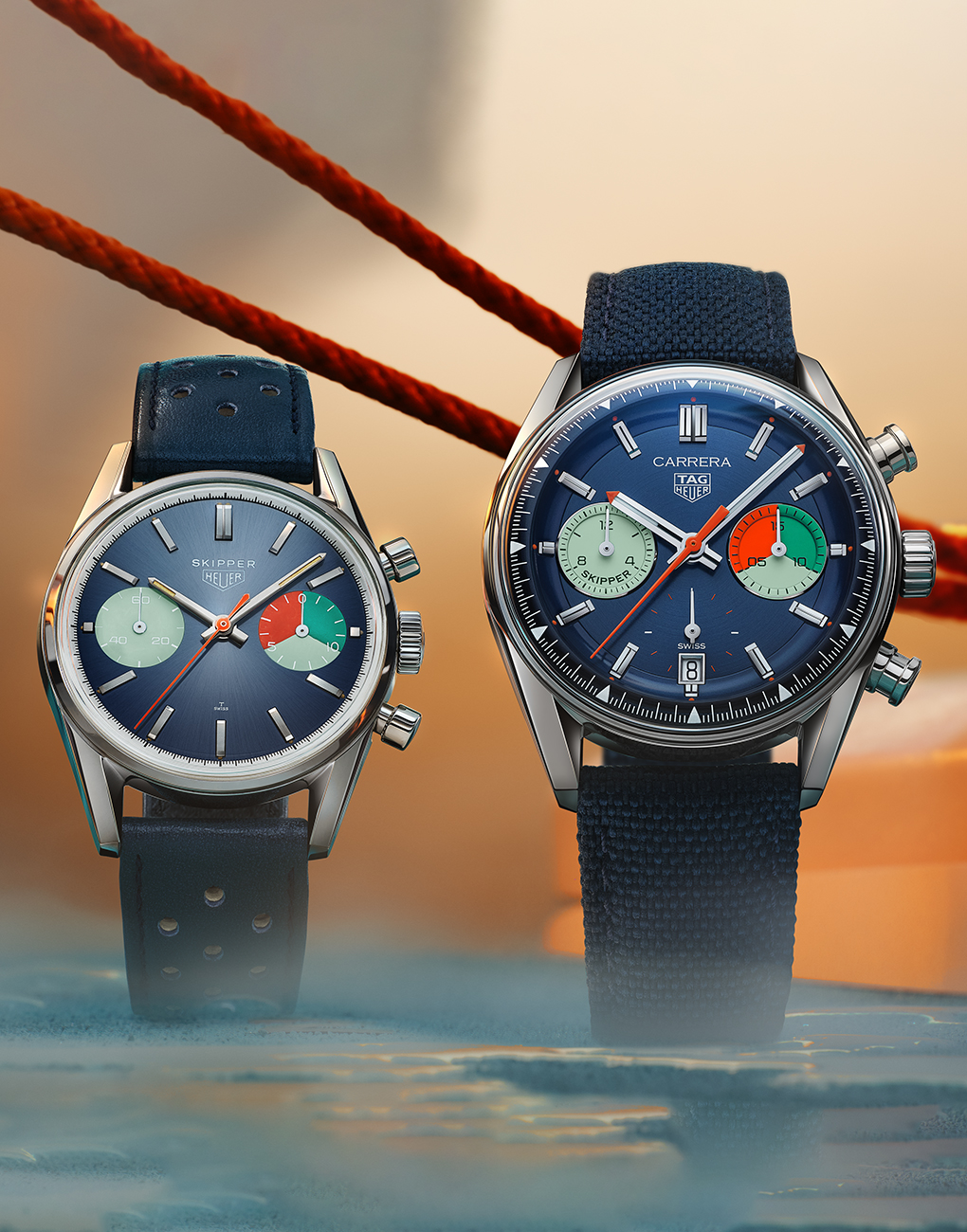
What is the reason behind reimagining watches from the past, such as the Skipper and Chronograph Dato? Has there been a particular demand, aside from the brand showcasing heritage and legacy of past achievements?
The reason why we do this is because heritage is very important to us and we are always looking to our archives for inspiration. Within those archives, there are some treasures. For instance, the Skipper is, to me, very unique and special. So, when you have a treasure like that, you want to revisit it, and what we’ve done isn’t simply copied the old watch, but we’ve reinvented it a little, with an update in the design, according to what our collections are today, in terms of style and the contemporary look of the brand. Yet, we have retained the essence of the piece from the past and what it stood for.
Other brands in the LVMH Group have also been reviving older watches. Is there a common product strategy within the group for certain kinds of watches?
No, we quite share our product strategies and plans with other brands within the group, so it’s probably just a coincidence that this is happening across the LVMH Group. Having said that, it’s not just this group. it’s even brands like Cartier and others who are bringing back their icons from the past, because heritage is a priority, and there is also demand from collectors. The end consumer is important to us. It’s what they’re looking for that we keep in mind.

Aside from a milestone like that of the Carrera anniversary last year, how is it decided that a collection needs a design refresh?
That’s a good question. You see for us. It’s all about quality. If we find that a particular product or collection no longer matches up to the current quality standards that we are following, then we decide that it needs a revamp. And the best time to do this is also when there is some kind of an anniversary or milestone to commemorate, which gives us the opportunity to tell the story of a collection, the heritage aspect, and its evolution. It then becomes a good time to bring out the latest version, updated to the highest present quality standards. We then also have to work with marketing to find out what story is the bets to tell and when, then it’s about making a decision because we can do everything at the same time.
What are the biggest challenges with living up to the brand’s motor-racing association, while also being able to appeal to those who have no interest in motorsports?
It’s true that motorsport is a big part of who we are, but then it’s also about sports at large. With the Aquaracer, we talk about water sports and diving and so on. And when it comes to the Carrera, of course it’s about motor racing, but it’s also about being carriers of the past. It’s about Jack Heuer, and his work in helping build the foundation for the brand. And then with the Skipper, it’s about sailing. So yes, motorsport is important for the brand. But it’s also about other sports, and so much more.
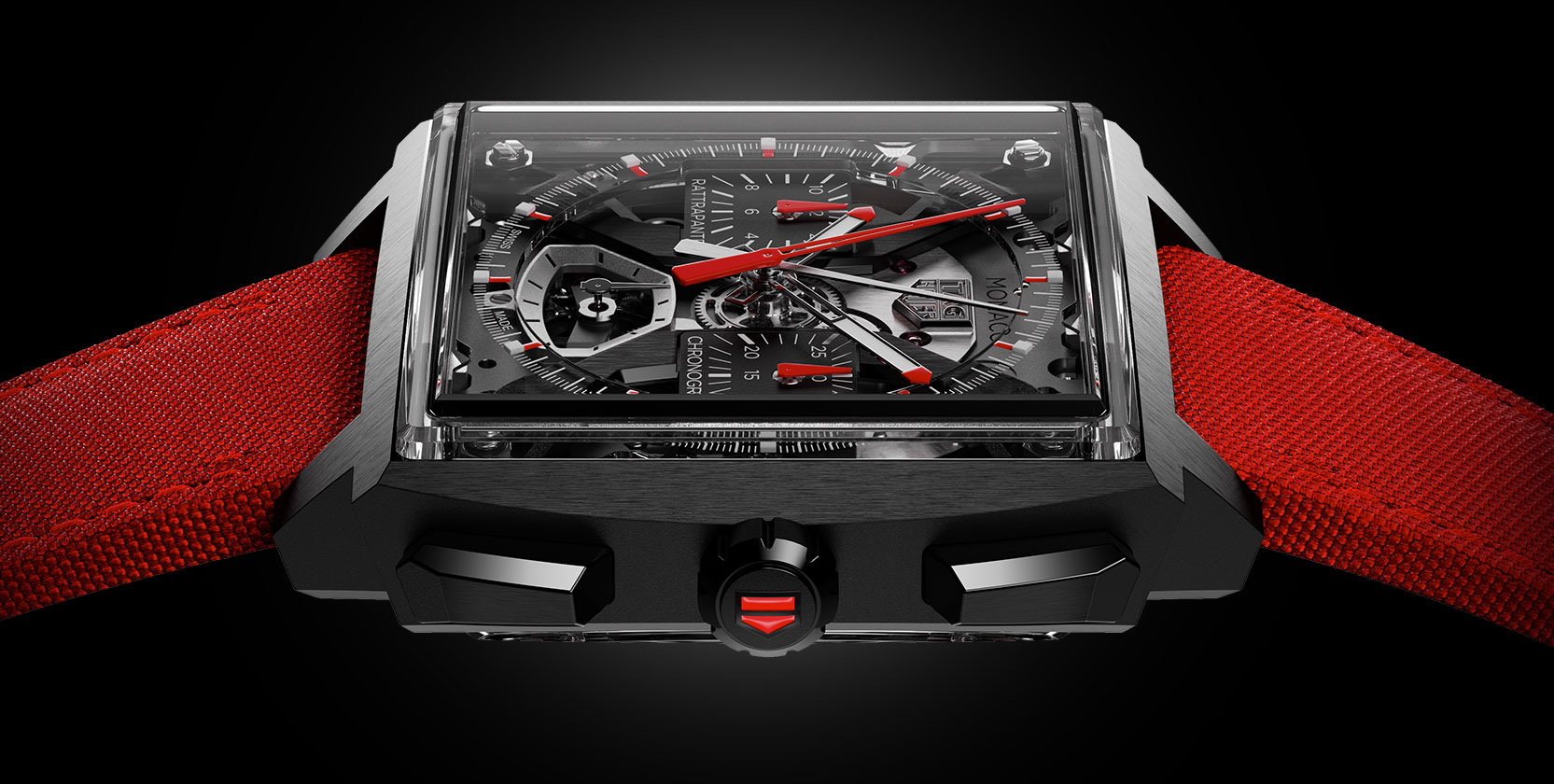
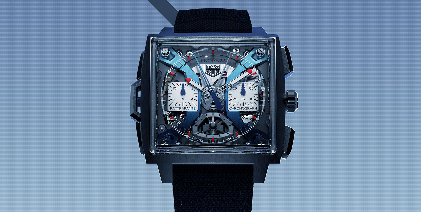
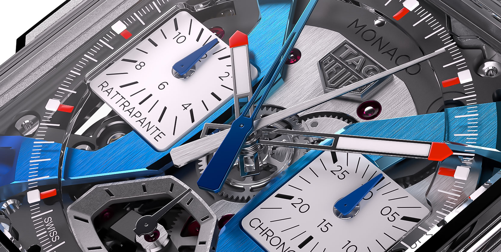
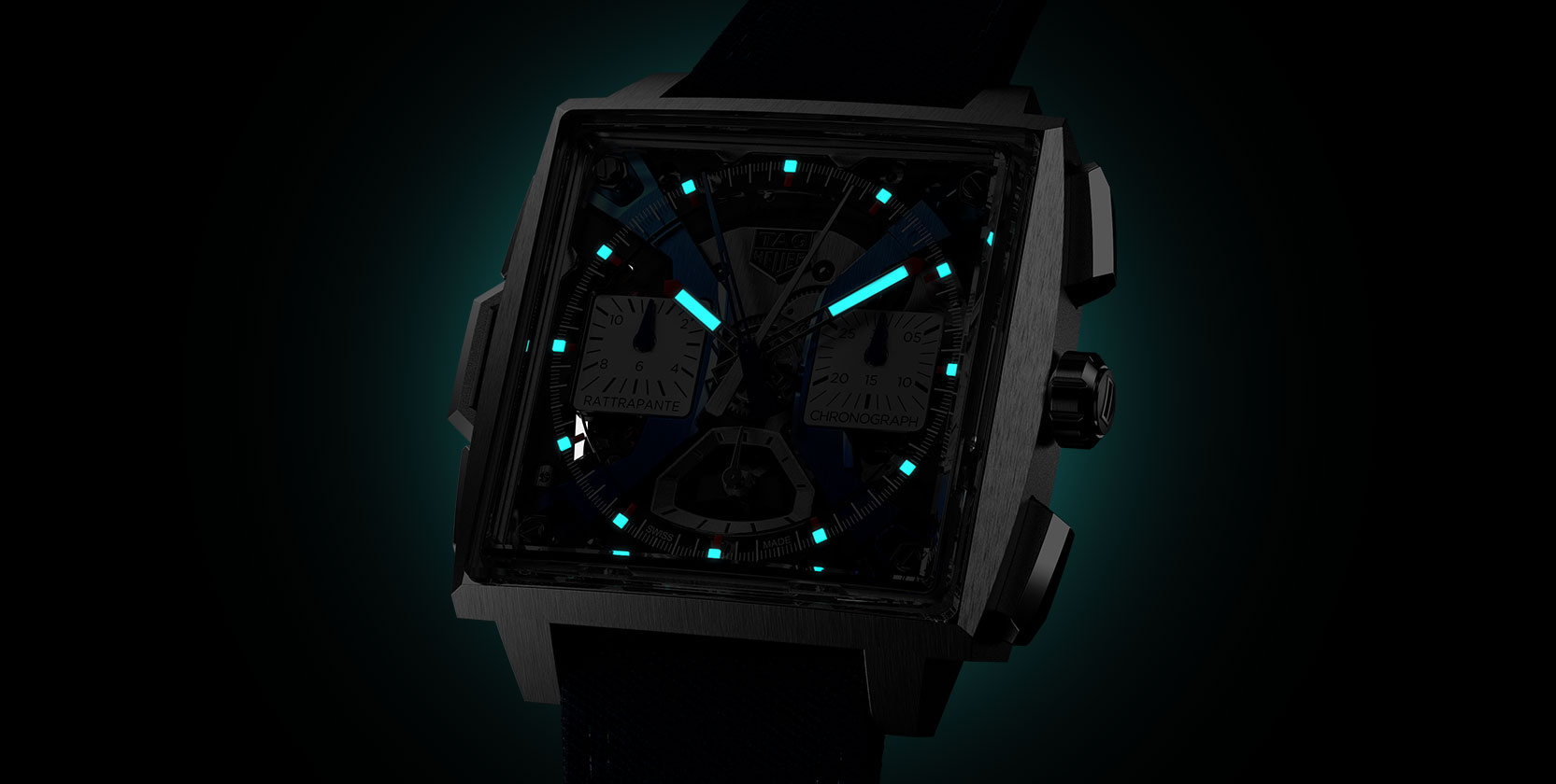
Talk about the split-second chronograph in the new Monaco. Is there any particular reason behind going advanced with the chronograph in this collection?
Yes, of course, for TAG, the chronograph is the king of complications and then within the chronograph category, the Rattrapante is the queen of chronographs. And since we are focusing on our haute horlogerie segment, we decided to bring a split-second chronograph into the mix. And given our heritage with stopwatches, this complication is something that fits right in with the brand.
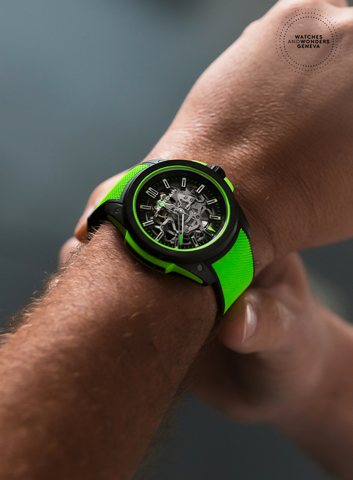
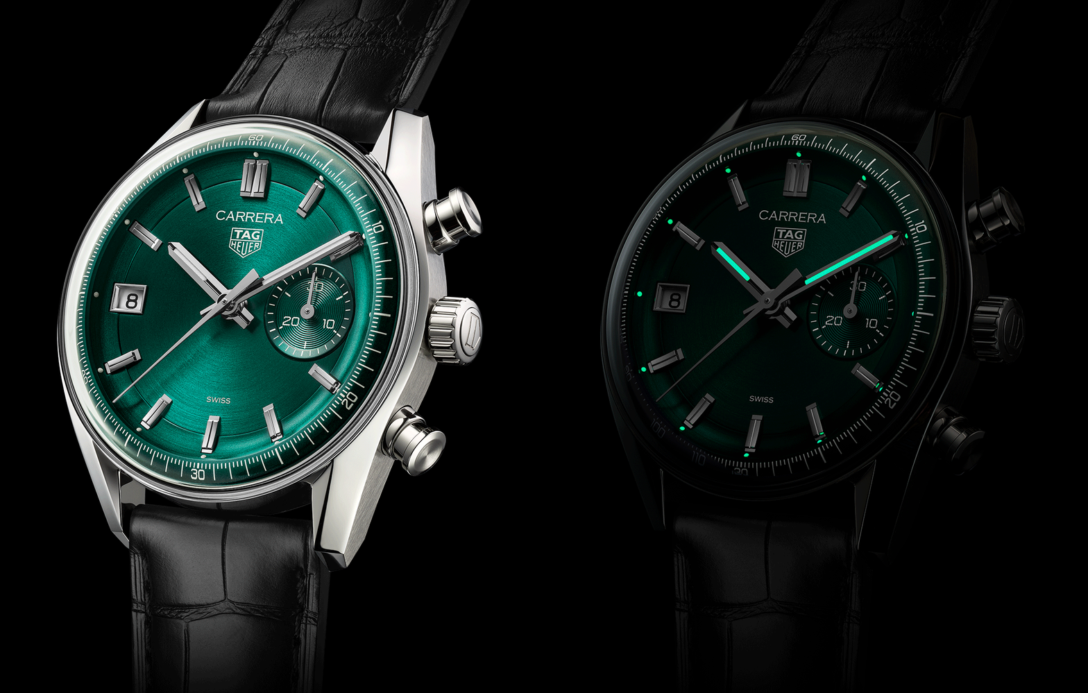
What has been the inspiration behind the use of such vivid colours that we’ve seen from TAG Heuer recently—such as the pink and the green or teal?
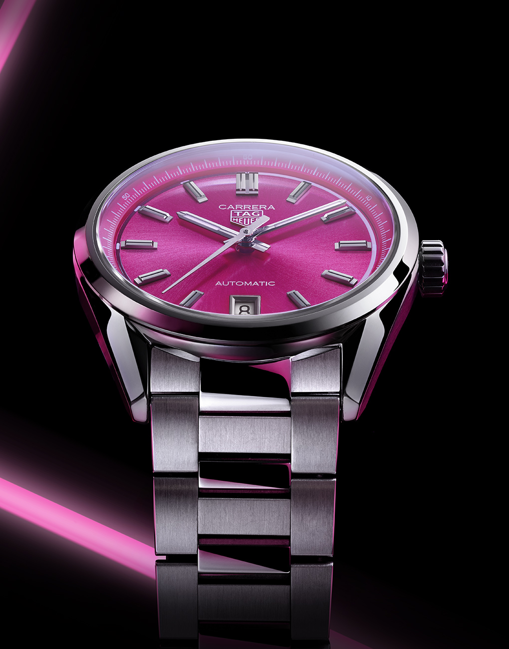
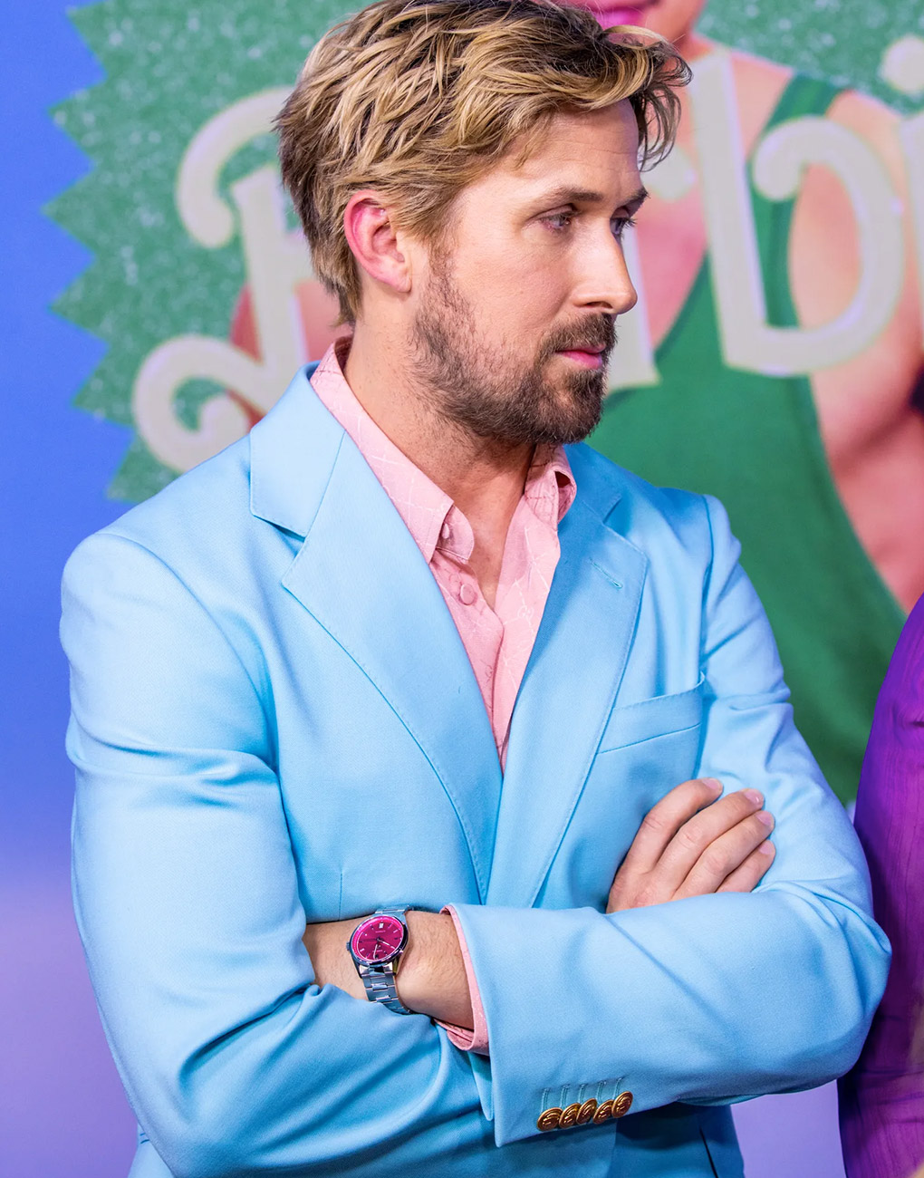
With TAG Heuer, we’ve always been strong on colours in the 1980s. We were among the first to make watches with vivid pops of colour in, collections such as the Formula One. Since then, we’ve always had a lot of colour. There’s been plenty of orange because that’s associated with diving, and even in sailing, it’s an important colour because it’s visible from far, at sea. And we wanted to introduce some new colours, hence we came out with the turquoise and the pink and such. The pink was a great success, which we brought out with the Carrera and at 36mm. Then our brand ambassador Ryan Gosling really liked the watch and he decided to wear it himself at various public appearances. Suddenly, there was there was this new attractiveness towards this colour. And then with the release of Barbie, pink became so popular once again.
A lot of brands seem to be releasing green watches this year. Would you say green is the colour of the year?
Well, you know I’ve said before that ‘green is the new black’ (laughs). Green is a very elegant colour, which has a little more than just black or just blue, and green also has some significance in some cultures.
What are the most prominent watchmaking trends you’ve observed over the last two years or so?
As I was saying before, authenticity and staying true to the heritage, and the value of brands has become even more important in recent years. And then there has been an acceleration in with the use of colour among many brands. The palette has become so wide.

How does your work with TAG Heuer compare with your past experiences at brands such as Chanel, Piaget and Van Cleef & Arpels? How have you been able to adapt from the DNA of one brand to another?
For me, that’s one of the most interesting parts of the job. Going from one brand to another means rediscovering the brand from the inside, understand the history what the brand stands for, the design language and so on. For me, the approach is the same—study the archives to understand the spirit of the brand, to learn the codes, and to build on those codes. It’s more or less the same for every brand the approach even though the brands may be completely different. Imagine, design, create—it’s the same approach. It is true that the playground is very different between Chanel, Van Cleef & Arpels and Tag Heuer, but the approach is the same. And it’s also refreshing, you know, to be able to change and do something different.
