ReviewThe Junghans Form A ‘100 Years’ Bauhaus Limited Edition—Presenting Time In Technicolour
Honouring Swiss artist Johannes Itten, one of the key contributors to the Bauhaus movement and its theories surrounding the interplay of colours, the Junghans Form A 100 Jahre Bauhaus presents a colourful interpretation of timekeeping
May We Recommend
It was over 40,000 years ago that our ancestors first invented the colour palette in art. They saw vivid colours in nature and sought to depict some of them on the blank walls of their caves. With the help of soil, animal fat, burnt charcoal, and chalk, they created colours such as red, yellow, brown, black and white. Some of these ancient cave paintings still exist for us to see. As the human civilisation flexed its evolutionary muscles and grew at an unimaginable pace, so did art and with it, colour. We created enchanting hues using what we had at hand—from flowers and gemstones to insects and animal bones—and art was no longer restricted to cave walls, which were at the mercy of nature. It took its place on the canvas and graduated to a variety of mediums, and the rest is (art) history.
And with the blossoming of our towns and our cities, design came to the fore as well. While the beauty of art always lay in the eyes of the beholder, design’s objective was purely functional. Around the 1860s, modern art and its experimental nature became the stroke of choice for artists. It was in 1919 that an idealistic man named Walter Gropius sought to bring the beauty of modern art and the utilitarianism of design, of form and function, under one roof and created an art movement that has no peer—Bauhaus.
You can read more about the Bauhaus movement here
A Monumental Movement
For those not in the know, Bauhaus is emblematic of simple, almost austere design schemes where less is more, and where form followed function, which was pushed from theory to practice in Weimar, Germany, through the Bauhaus school of art from 1925 to 1932. One of the first teachers employed by the school was a Swiss expressionist painter named Johannes Itten. Itten taught an introductory course on form and colour, and wrote a book on the subject, titled The Art Of Color, describing colour theories that form the crux of the works of many artists even today.
Johannes Itten’s colour wheel, with its harmonious design and presentation, still finds favour among artists and designers. It is this colour wheel that forms the basis of the design of the Junghans Form A 100 Jahre Bauhaus, a watch that was released to commemorate the 100-year anniversary of the Bauhaus movement. Jahre is German for ‘years’.
Your choices in watch colours say a lot about your personality. Read more about it here
The Colour Wheel Of Fortune
We all know what primary colours are: a set of colours that, when combined, can provide a versatile and useful range of hues. While we’re very familiar with red, green, blue (RGB) because of its widespread use in digital media, Itten theorised a colour wheel based around red, blue and yellow instead of green—a palette still expansively used. Itten’s colour wheel is based around the triangulation of these three primary colours (RYB). Around this is a hexagon consisting of the colours that can be made by mixing the primaries, ie the secondary colours—purple, green and orange. Finally, we have the actual wheel, which comprises these two colour groups, along with tertiary colours, which are made by mixing a secondary colour with a primary colour. There are six tertiary colours in total—red-orange, yellow-orange, yellow-green, blue-green, blue-violet and red-violet. When put together in the wheel, as Itten did, they amount to 12 in total. This is the fortuitous sum that the watchmakers of Junghans took advantage of, and borne from this is the Junghans Form A 100 Jahre Bauhaus, the watchmaker’s colourful take on the essence of simplicity.
Quietly Elegant, Vibrantly Distinctive
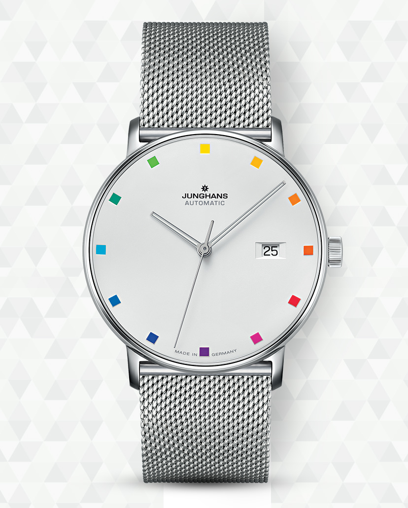
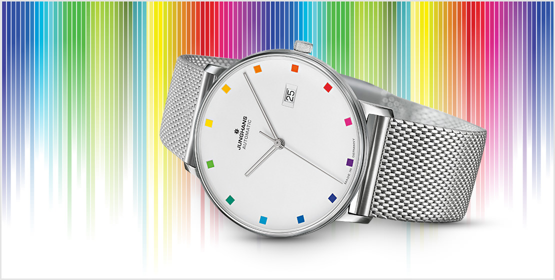
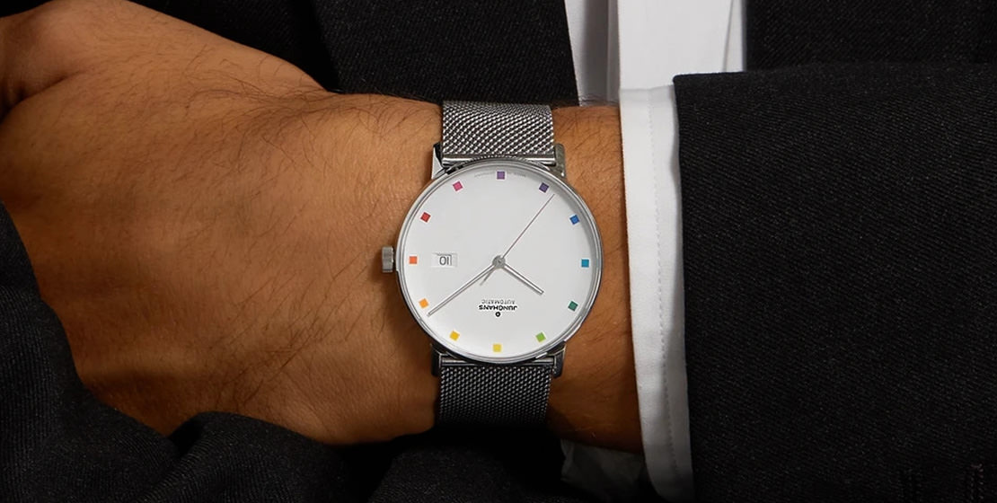
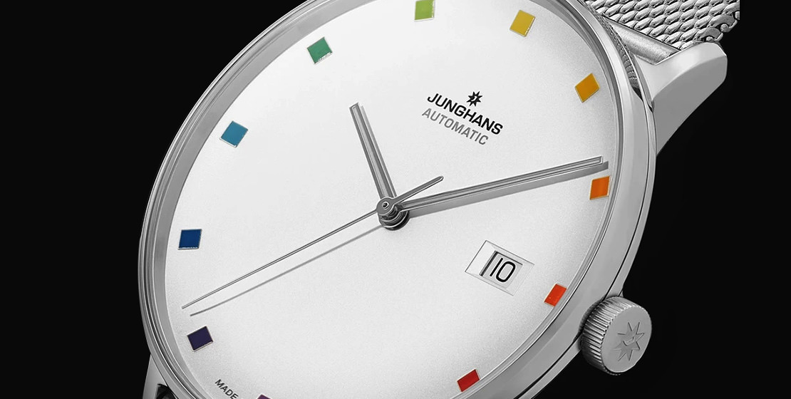
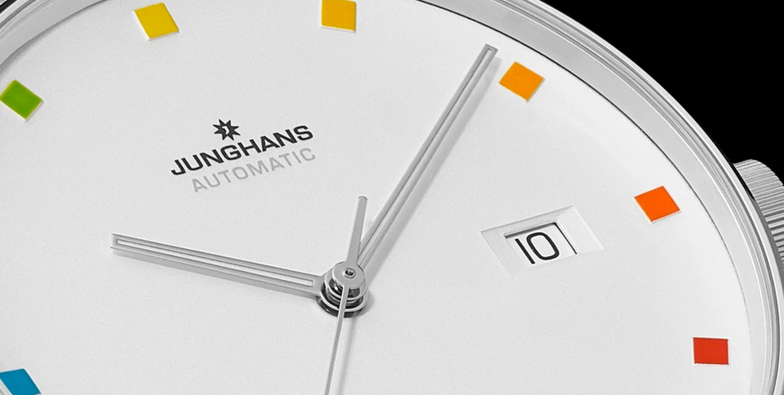
The 39.3mm stainless steel case houses the silver-plated dial with a matte finish, which is the main attraction of this timepiece. Each square that represents the hour on the plain white dial represents a different shade from Itten’s colour wheel. The plainness of the dial only serves to highlight the vibrance of the hour markers. As Matthias Stotz, Junghans’ CEO puts it, “We decided to put 12 colours like tiles on the dial. We had a very difficult (time) printing, with one printing for the brand name and 12 additional colours for the tiles. The special concave ‘bowl’ shape of the dial provides a really good platform for these tiles, and it makes the colours pop. So the watch is contemporary and fresh. Bauhaus is becoming more and more popular around the world, even with younger people.” What I personally find most interesting is that noon, when the sun is at its strongest, is also represented by the colour yellow, while the cooler hours of the evening are shades of blue. This only underscores that the colour wheel and its place on the watch face are the most providential of combinations. A unique interpretation of the austerity of Bauhaus design, this watch has been given a rather cheerful twist.

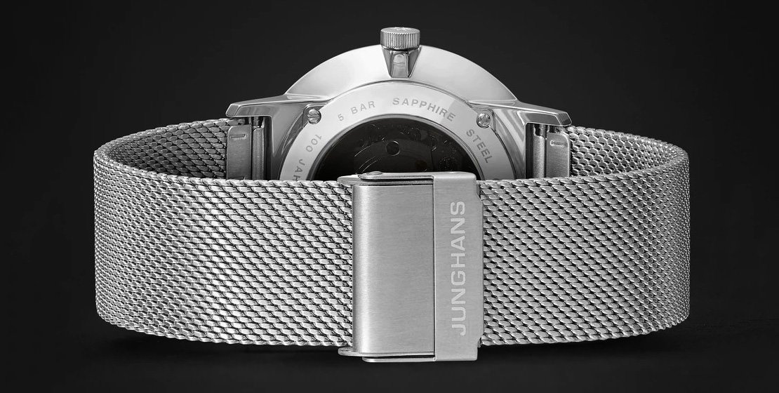
A date window is placed neatly at three o’clock. Baton-shaped hands point to the hours, keeping the design simple yet aesthetically pleasing. These hands have been coated with Super-LumiNova, for days that aren’t so bright and colourful. An understated Milanese bracelet makes for the perfect attachment, as it keeps the focus on the dial at all times.
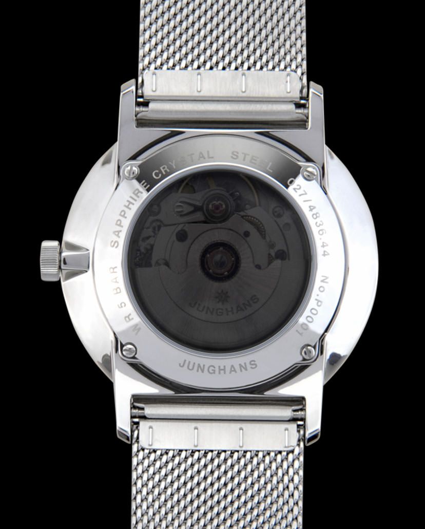
The exhibition caseback gives the wearer a glimpse of the self-winding J800.2 calibre driving the hour, minute and seconds functions, along with the date complication. This movement provides a power reserve of 38 hours. The watch is water resistant to a basic 50m.

Limited to 1,000 pieces, this is a watch that’s compelling, versatile and engineered to perfection. The Junghans Form A 100 Jahre Bauhaus is a timepiece that draws your attention without shouting for it, and a statement you can wear on your wrist with pride.
